
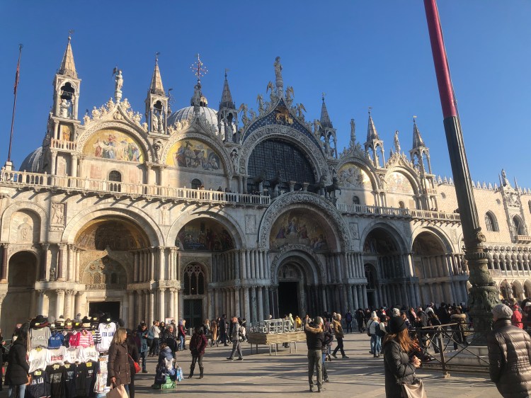
Basilica di San Marco
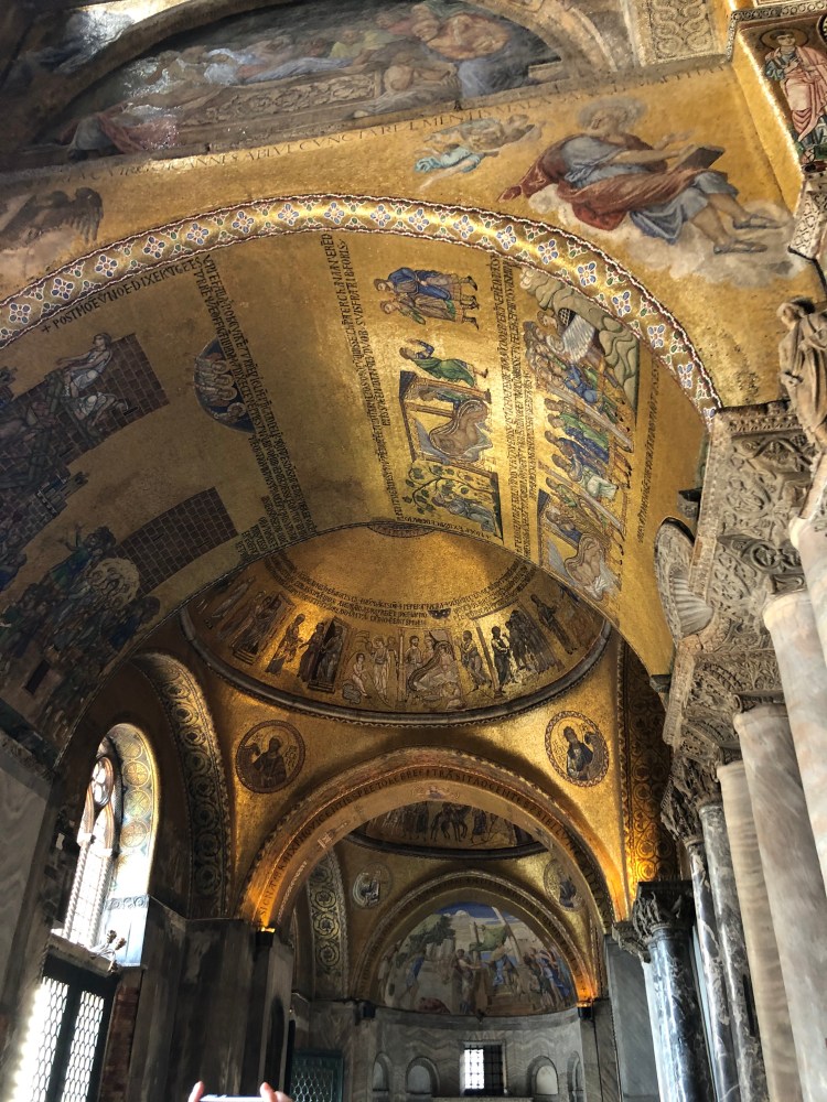
One of the most famous and important buildings in Venice is the Basilica di San Marco Cathedral. Walking up to the building I was astonished by the size and detail of the architecture. The construction was done by a Greek architect starting in 1063 and consecrated on October 8, 1094 when the body of St. Mark was deposited in a marble tomb under the high alter. The cathedral was created by influences from the middle east. The cathedral was continuously enlarged, and additions kept being made. People travel from all around the world to see this amazing architecture and artist design.
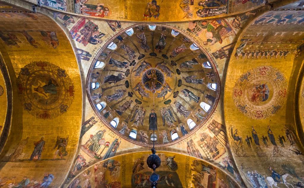
The mosaic decoration began in 1071 and continued with each period contributing their own artistic elements. These mosaics are the main element people notice and think about the church because they are intriguing how detailed and beautiful they are. Each mosaic has a different function and story to tell. According to the Basilica di San Marco website, “They represent stories from the Bible (Old and New Testaments), allegorical figures, events in the lives of Christ, the Virgin Mary, Saint Mark and other saints.” They have Greek origins and are covered in warm colors, mostly gold so that it would be able to be reflected and lighten up the church. Each time of day with the ever-changing light will create a different range of intense effects. This Cathedral was my favorite one so far because of these mosaics. The time and effort that must have gone into each piece really makes me appreciate the end result of all their hard work.
Jackson Pollock
During our visit to the Peggy Guggenheim museum I was pulled into Jackson Pollock’s works. His collection that is on display there is the type of work that I enjoy. It is abstract and makes you look closely and discover new things within each painting the longer you look at each painting. He has six paintings on display in Peggy’s collection all together in one room. Going back and forth between each painting I loved the similarities I found between them.
The paintings Eyes in the Heat (1946), Alchemy(1947), and Enchanted Forest (1947) were my favorites of the collection. Each of these is very similar when you first glance at them but if you look closely they are all different with the colors and think and thin lines used. All three of these used his abstract style created by the pouring, dripping, and splattering of paint on large surfaces. These types of techniques of paintings interest me because at first it looks simple but actually is very hard to create and make it look cohesive. Referring to Eyes in the Heat, “The watchful eyes of creatures concealed in the paint appear here and there, in their proliferation mimicking the restless movement of the viewer’s eyes.” This is very true because while viewing this my eyes kept following the many curved lines throughout the entire painting. The textures of these paintings were so deep and is the main reason I enjoyed them so much. The colors used in these three paintings worked well together and each had colors that popped within them. He used mainly black and white with throwing in other colors such as red, blue, yellow, and green within each one to make them stand out and complete the painting.
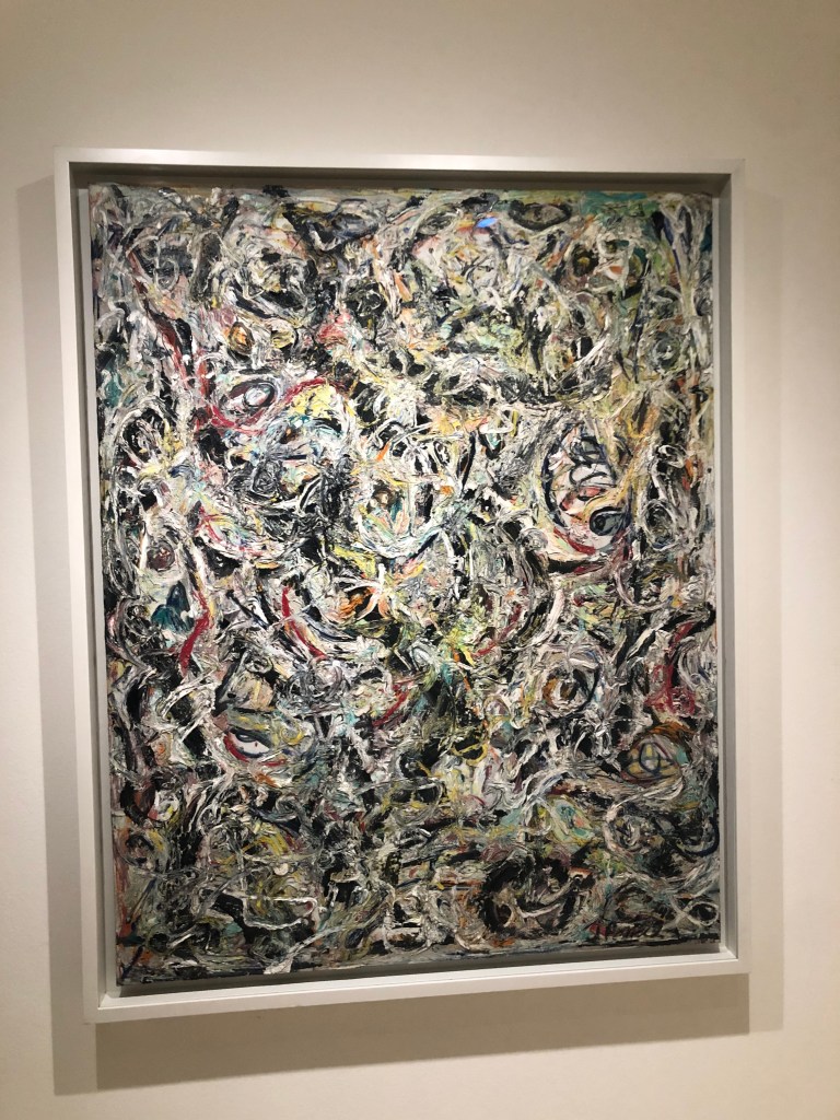
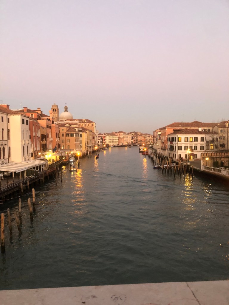
Photo: Hailey Kostin

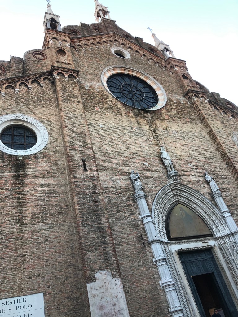
Photo: Hailey Kostin
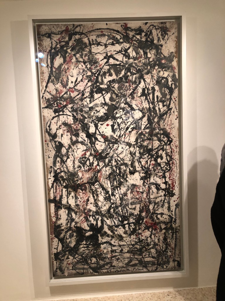
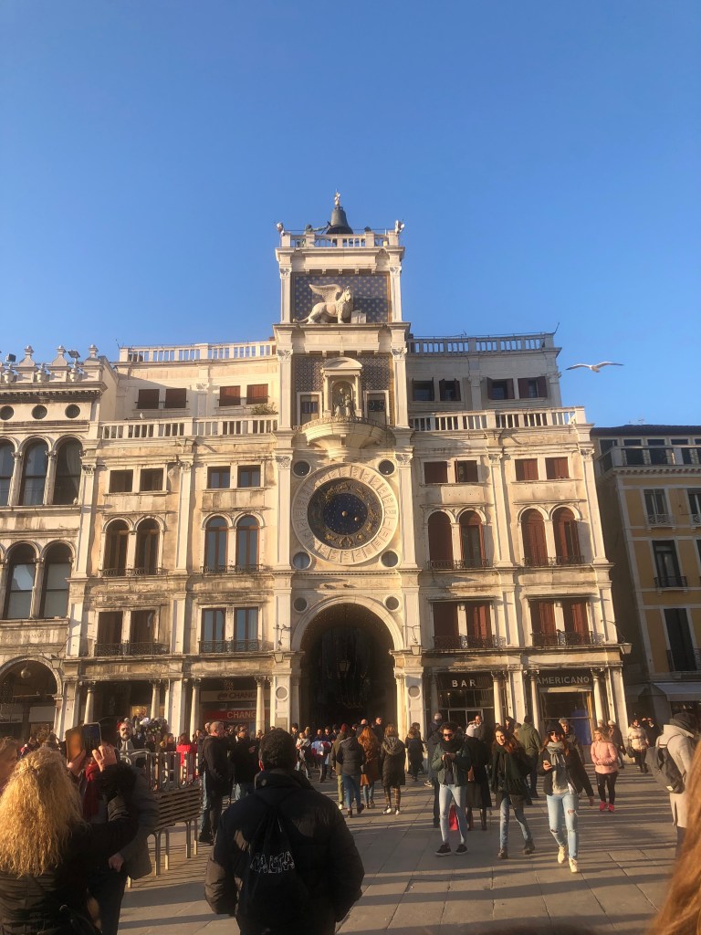
Photo: Hailey Kostin
References
Guggenheim, Hanger Design Group, http://www.guggenheim-venice.it/inglese/collections/artisti/dettagli/opere_dett.php?id_art=128&id_opera=285&page=.
“Mosaics.” Basilica Di San Marco, Procuratoria Di San Marco Di Venezia, http://www.basilicasanmarco.it/basilica/mosaici/?lang=en.
